typography

Webs We Weave

scarf_up.jpg

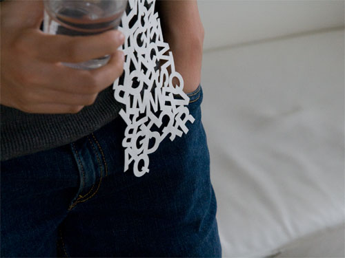
How badly do I want this uppercase scarf? Pretty badly, I tell you. The scarf led me on a typographic journey of the net which yielded new interesting sites: the & Blog, Bembo's Zoo which is seriously cool, FontStruct which lets you design your own (very basic) typefaces, and, er, The Swedish Furniture Name Generator.

Hey, I can't be all arty and intellectual all the time!

How about A.S. Byatt on textiles, textures and texts, then? It marries all my loves: books, texts, literary theory and, ahem, yarn.

Sleeping Beauty pricks her finger on a spindle, the Lady of Shalott is entwined in thread, Silas Marner is enclosed in his loom - why have spinning and sewing so often been associated with danger and isolation? (..) We think of our lives - and of stories - as spun threads, extended and knitted or interwoven with others into the fabric of communities, or history, or texts.

Brain Bling

How good are you at recognising fonts? I got a measly 24 right out of 34. At least I still know my Helvetica from my Arial. It's all in the curves, baby.

I have actually been watching quite a bit of TV lately. BBC4 is having a rather funky Medieval Season, so I've been lapping up programmes on Thomas Aquinas, Abelard and the aformentioned Stephen Fry & the Gutenberg Press (which was pr0ntastic, incidentally). I get to flap my arms around excitedly and repeatably which is really nice. TV, I forgive you your multitude of sins when you indulge me like this.

Finally, I'd like to thank everybody who asked for my mother. She was discharged from hospital on Tuesday and is back home again. It is a relief.

They Used Wine Presses, You Know

Me mam's apparently doing a bit better. It's slightly strange to be in another country and not being able to rush to the hospital.

Somebody at BBC is my new friend. Stephen Fry & the Gutenberg Press is showing on BBC4 tonight so whoever greenlighted that show gets to be my friend. Yes I'll sit there with popcorn shouting at the telly whenever they say something vaguely incorrect (or get too carried away with the entire 'cultural revolution' - too Eisenstein and not enough Johns for my taste. I just know they'll fly on the wings of the "printing press as agent for change" thing and there are so many problems with that idea..). Oh, my heart be still.

Related-ish: two ways of debasing/defacing/recycling books (delete as appropriate):
+ Nicholas Jones - Book Sculptor
+ How to make a handbag out of a book

I'm not sure I approve.

Fragments

I have my book! I also have dirt on my forehead from when I blacked-out in the middle of a path and somehow avoided the broken glass bits. And in a minute or so I will have a cup of coffee right next to me. Life is so exciting! Confession: I have a weakness for very silly Ben Stiller films. Dodgeball and Zoolander, particularly tickle my funny bone. So, when I saw the trailer for Tropic Thunder, I felt compelled to spread the news: think Apocalypse Now but with Ben Stiller as an action hero, Steve Coogan as the director and, er, Robert Downey Jr as an Australian Oscar-winning ah-k-tor who takes method acting to extremes .. It'll probably be utterly naff but I like being utterly naff at times. Sue me.

Okay, less naff entertainment: do judge a book by its cover. Aww..

Roses Are #FF0000

It's Valentine's Day today. I have already my present from my Significant Other: a facsimile of the Kelmscott Chaucer. Aww.

Equally geeky/sweet: Typecaster. "A Flash app [that] lets you drag two fonts from the left side into the stage area... to see how well the two types mix when dating (fonts available are Mistral, Papyrus, Comic Sans, Helvetica, Stencil, and American Typewriter)." I particularly like the type description of Papyrus.

Public Writing

One of my current preoccupation is the idea of public writing - that is, writing/lettering/typography found in public places and spaces. I take photos whenever I see somebody doing something interesting - whether they be commissioned or non-commissioned pieces. I have even tentatively put together a small Flickr-set of some of my photos. One of my favourite examples stem from my erstwhile hometown of Copenhagen, Denmark. I was walking along a wall when I noticed the street name elaborately carved into the bricks. Above the carved brick you had the traditional blue-white street sign with the same name. Two centuries of labelling streets in one go. I was excited by the juxtapositions: permanence vs. easily replaced and serif vs sans-serif. I was also excited by how the contemporary street sign had been placed higher than the carved brick as if to exercise its dominance, its importance.

One of my Scottish friends, Fi, works as a curator and we recently spoke about the concept of public lettering and writing. Fi mentioned that the first thing was sprung to her mind was the Scottish Parliament's Canongate Wall. It is absolutely fascinating: various stones with quotes on Scottish identity and history are inserted into an outer wall, so anybody walking along the street will be asked to reflect upon Scotland, art and identity. Even the pavement has slates engraved with sentences. And, as I agreed with Fi, that is really a great example of public space and writing being combined to great effect.

And then you have non-commissioned stuff like graffiti and posters and random notes put up in windows..